Green Is The New Blue: 2021 Is A Green Year
26 April 2021There was a time, not too long ago, when high-end mechanical watchmaking offered certainties, at least regarding the color of the dials. White on the classic models and, eventually, they could be lacquered or enamelled. Silver matched the sports fashion. Divers and the military focused on black. And when the case was made of gold, it often came with champagne. That’s it. The rest were exceptions or interpretations tending towards fashion, such as the Rolex Precision that brought an array of colors to its “entry level” collection of the time.
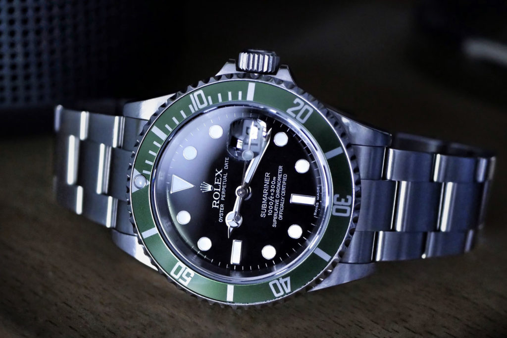
GREEN TURNING UP IN THE ROLEX SUBMARINER REF. 16610LV
Afterwards, among the mainstream brands, it is the Genevan house that in 2003 mounted a green bezel on its timeless professional watch, the Submariner Ref.16610LV (LV stands for Lunette Verte), to celebrate fifty years of the iconic diver by matching that shade of green – which has characterized the livery of the crowned brand for “centuries”. Just as red is to Ferrari – as Enzo Ferrari said: “Ask a child to draw a car and he will surely make it red” – and also to Coca-Cola. And just as, to name a few more, blue represents Tiffany with the famous Pantone 1837, and canary yellow sticks to the Post-it.
BRAND IDENTITY BASED ON COLOR AND LOGO
Inevitably, when a brand is so bold as to be identified with a color in the collective imagination, that means ithas struck the minds perhaps even more than a stylized symbol needing nothing else in order to be recognized (Nike’s “mustache” or Apple’s bitten apple, just to be clear). And why is this all so important?Well, it is not necessary to have studied marketing to understand that a particular color, together with the logo, represents a fundamental component of the brand identity of a company, especially if it is historical and if it wants to be a market leader, influencing it through their choices.
GREEN BEZEL, HULK, STARBUCKS… ROLEX ADDS ITS TOUCH OF COLOR
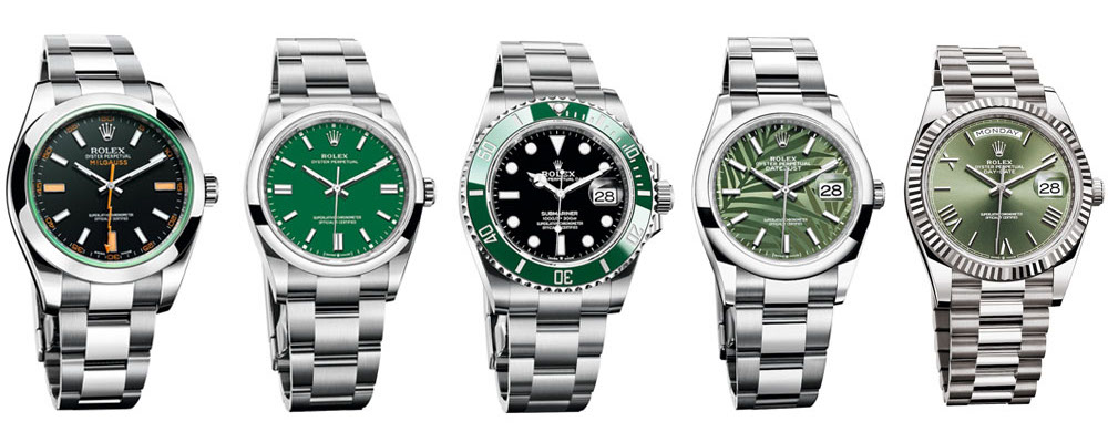
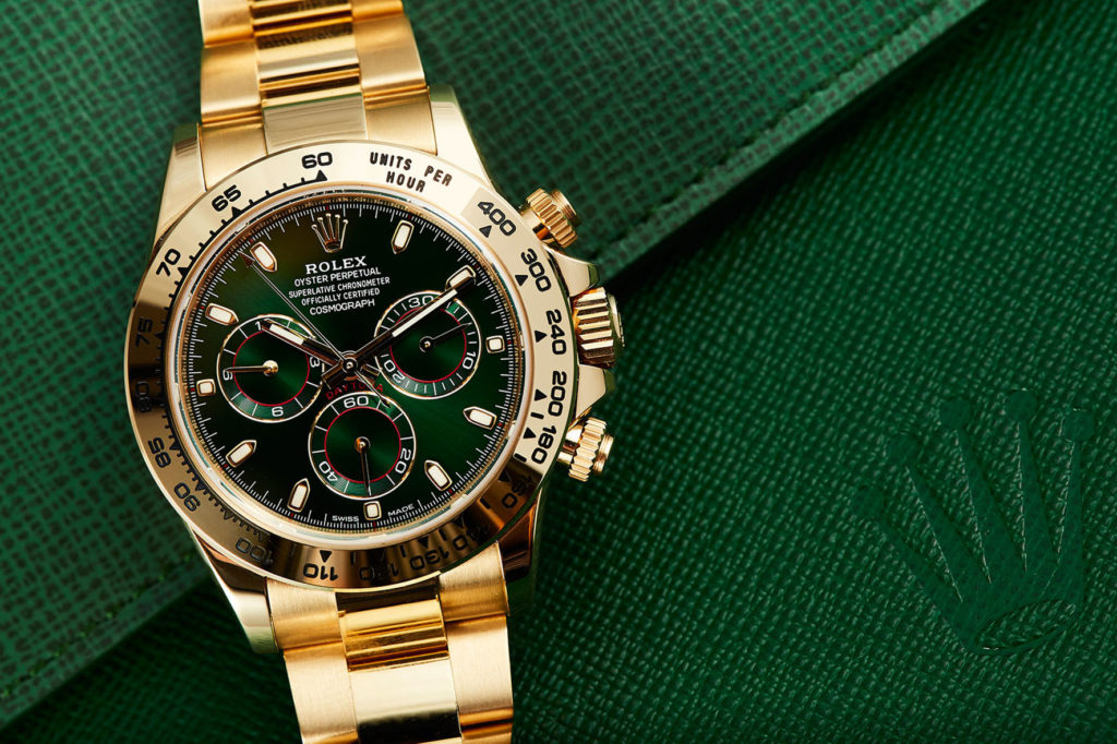
Back to us, from the “Green Bezel” onwards Rolex has never stopped offering models “dressed” with its typical color in every collection. Think of the “Hulk”, recently out of production, the Milgauss, the edge of the sapphire crystal, think of the different and, more-or-less recent, Day‑Date and Datejust, and two of the super hot references of the moment: the Submariner Ref.126610LV, AKA “Kermit” or “Starbucks” – here’s another “trademark color” –, the Oyster Perpetual 36 and the sumptuous Daytona bracelet in yellow gold.
FROM THE “BLUE PAINTED BLUE” TO THE WIDESPREAD EXPLOSION OF “GREEN FASHION”
If green characterizes Rolex, it is obvious that it is not exclusive to the brand. On the other hand, the same phenomenon happened with the blue dial, the iconic color of the two sporting masterpieces by Audemars Piguet and Patek Philippe: Royal Oak and Nautilus – which obtained commercial success with the related References 15202 and 5711. That sales boom marked the beginning of a long “blue season” for all the other brands, which also saw a proliferation of new bracelets integrated with the cases, very similar to those of the two legendary “radical-chic” steel models designed by Gerald Genta.
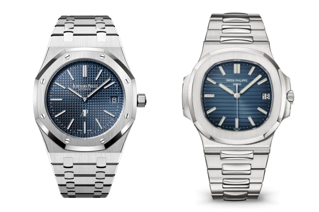
In both cases, anyone who used green and blue has always risked the comparison or, worse, emulation – with enthusiasts noting: “But it’s the same color as…”. Then came 2021. Maybe it’s for the success of the “clean” Tesla. Maybe it’s for everyone’s increasingly “green” soul, which also makes high-end watchmakers imagine to start offering cases and straps made of recycled materials. In short, whatever happens happens, but the news coming from all the brands announce the boom of the “Green Is the New Blue” concept.
GREEN ALL THE WAY, UP TO THE ROYAL OAK AND THE LAST NAUTILUS 5711/1A
Dozens, in strict alphabetical order: Audemars Piguet, Breitling, Cartier, Chanel, H. Moser & Cie., IWC, Jaeger-LeCoultre, Oris, Patek Philippe, Piaget, Tag Heuer, Tudor, Montblanc…
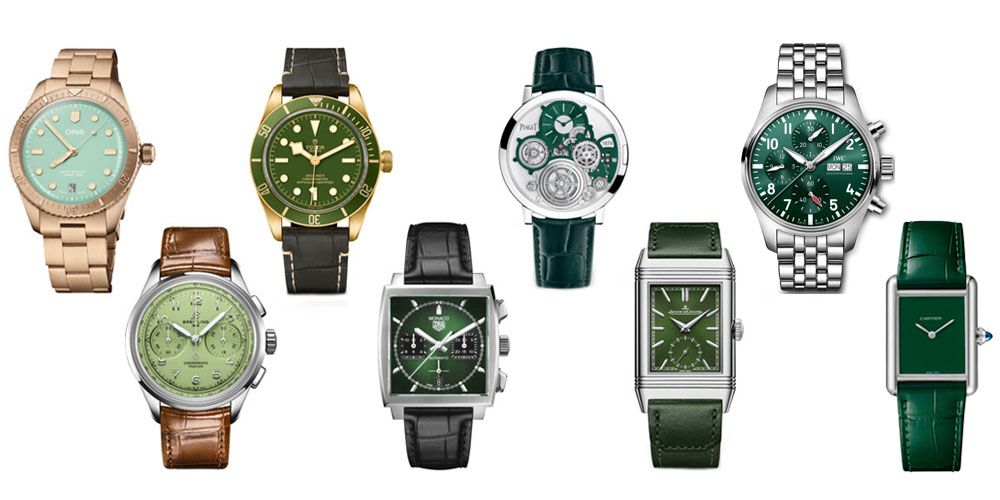
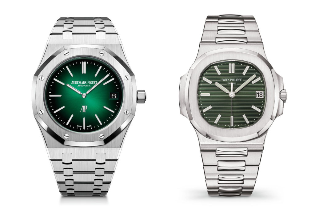
And then we lost count. Almost all are successful watches, some among them are even very beautiful, and a handful are pieces destined to leave their mark. Above all, the Royal Oak “Jumbo” Extra-Flat which now, in the version with a platinum case, marries the smoky green dial with a soleil motif. Not to mention the last Nautilus, in the aforementioned Ref.5711/1A-010, which abandons its highly imitated blue dial for a new olive green. And with this new look it will undertake its triumphal “farewell tour”, as the Stern family announced that this year will be the last of the steel 5711/1A.
ALL GOOD, BUT WHAT ABOUT BRAND IDENTITY?
From olive to pistachio, what can we say about this green boom? Is the mechanical watchmaking industry glancing at high-end fashion? Green is trendy this year, and the next? Joking aside, even if it were, it wouldn’t be a wrong thing. The important thing for brands is to make watches that, with their aesthetics, gain the public’s favor – in order to sell them. And that these watches offer valuable content to fans – as a sign of respect – and also the right relationship between quality and price in each price segment. And what about what was mentioned earlier? In other words, the fact that it represents good Brand Identity – historically Rolex’s great added value – which makes a brand immediately recognizable. Well, we’ll leave the answer to Shakespeare’s Hamlet: ” To be or not to be, that is the question.”
By Michele Mengoli
